case study
quality built from the earth
client
Buckingham Slate
services
- logo development
- brand guidelines
- supporting elements
- collateral
- website
Buckingham Slate is the highest quality slate on earth, mined in Arvonia, Virginia. Their distributors can be found across the United States and their product is present in several higher, historical, and design-focused structures. The slate has a low absorption rate making it resilient to extreme weather conditions and the sun. Because of this, the slate never loses its colors or structural properties and lasts a lifetime. The most popular product is roofing, but the slate can also be used for architectural or structural purposes and hardscapes.
carving out a new brand in stone
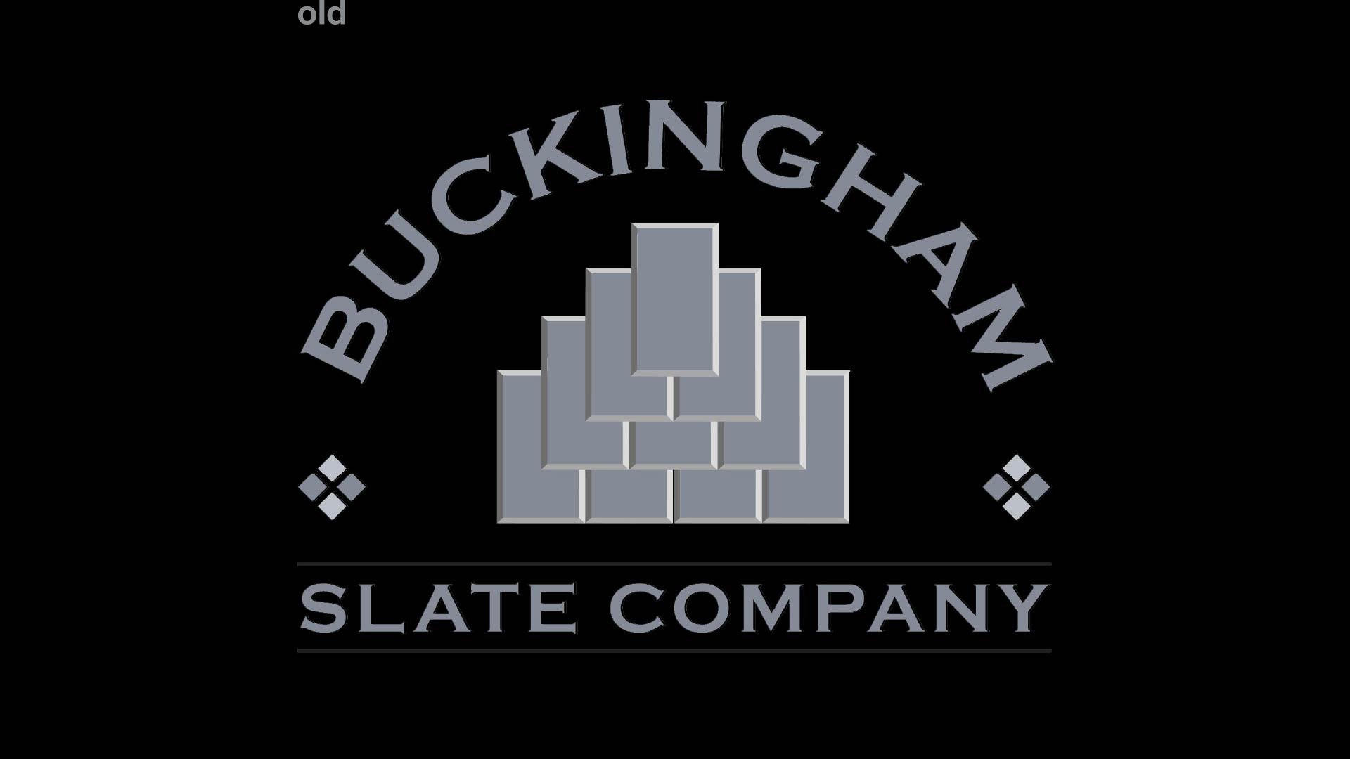
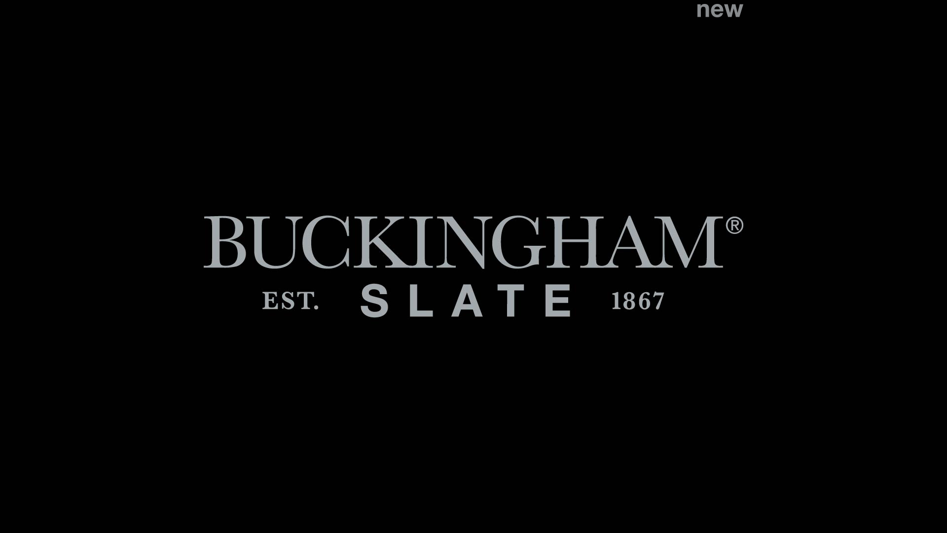
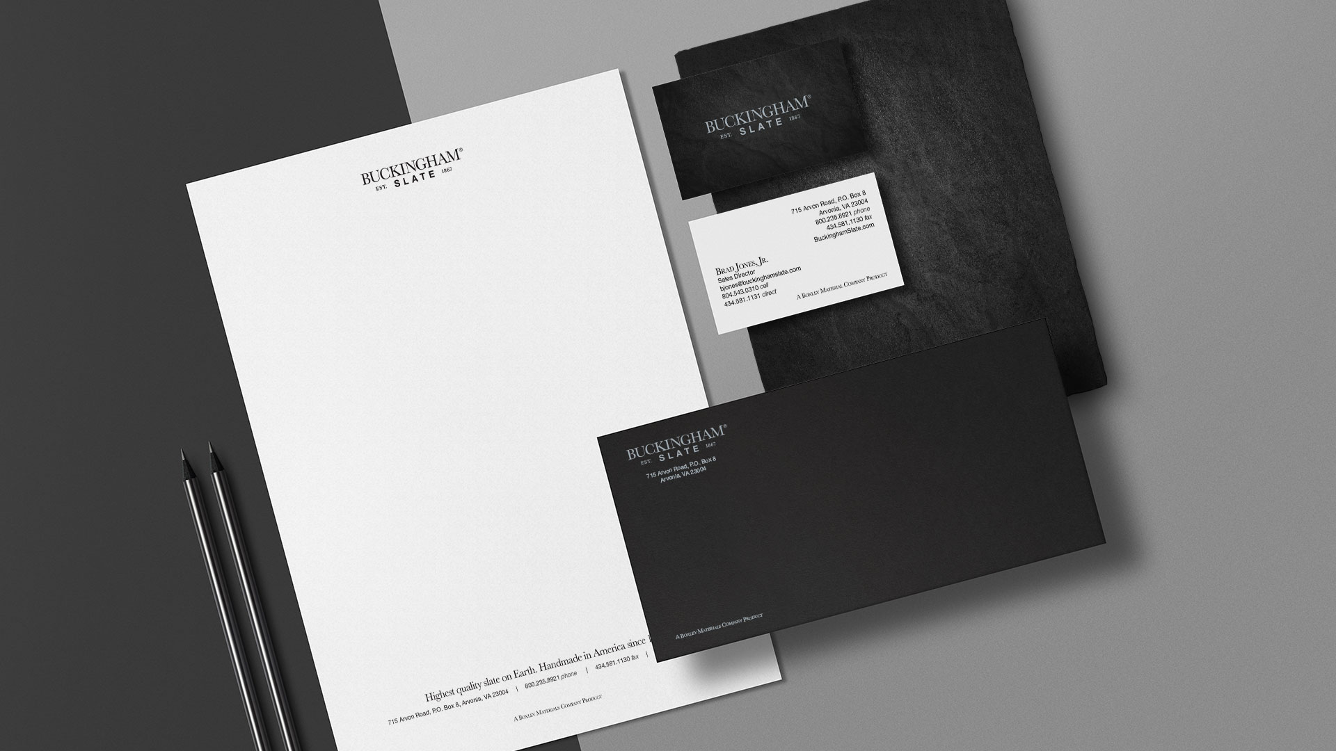
We were asked to help modernize Buckingham Slate with a fresh rebrand but still tie into the historical longevity of the company and its new product offerings. The previous logo used roofing tiles as its graphic, but we quickly removed those so this wouldn’t take away from the other product offerings. We chose a serif font for the Buckingham name to show their historical value and tied it with a san-serif font for the word slate to showcase their modern product. We also included the established date to solidify the quality and historical value they bring. By taking these ideas to create a minimalistic brand that brings a sense of distinguished personality.
product clarity in collateral
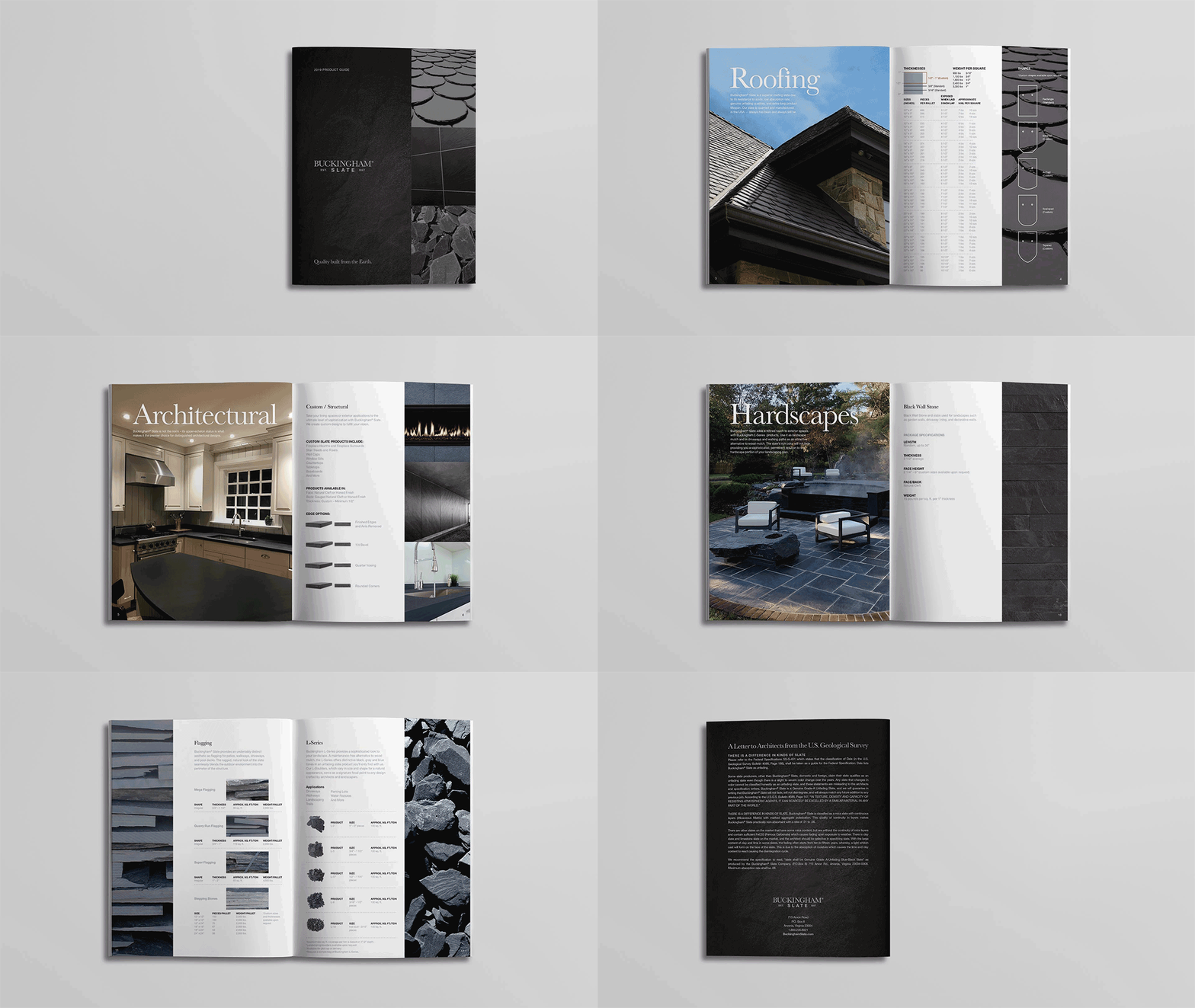
Buckingham Slate needed a capabilities brochure to help sell their products and introduce the new brand look. This booklet was designed to focus on the material, application and design, and end-use to reach the eyes of architects and contractors.
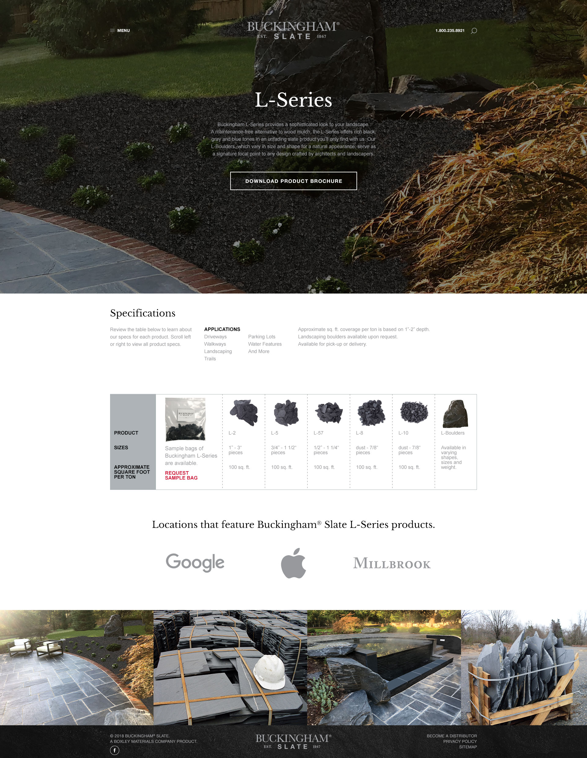
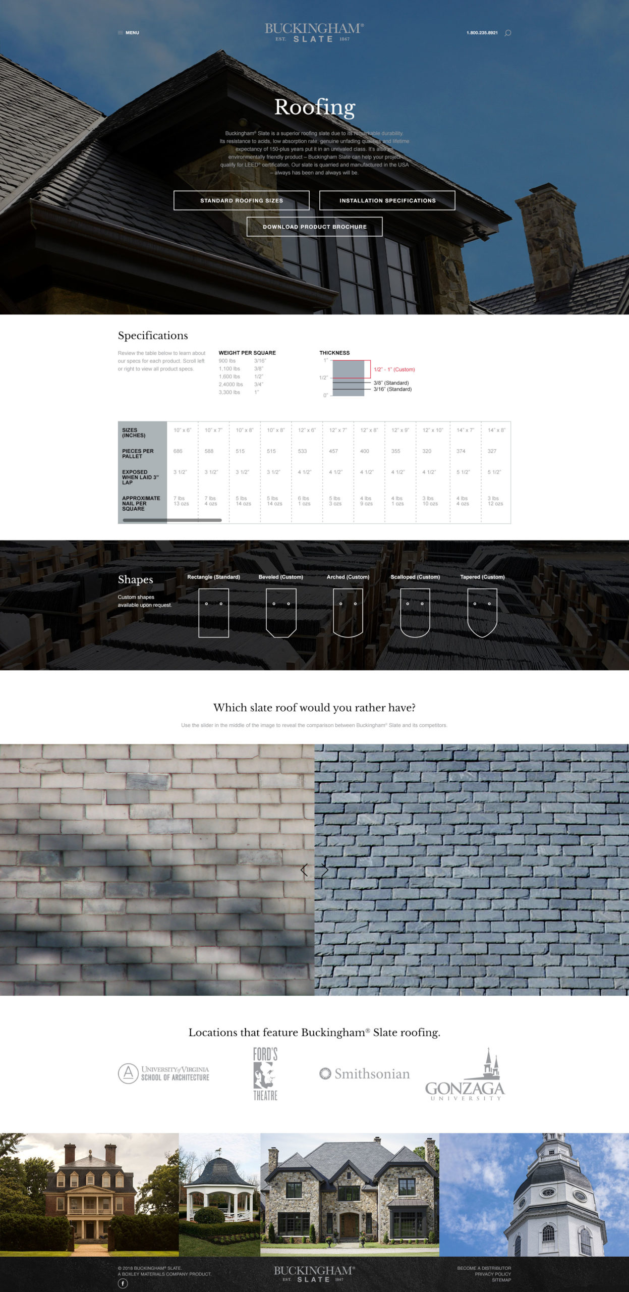
branding digitally
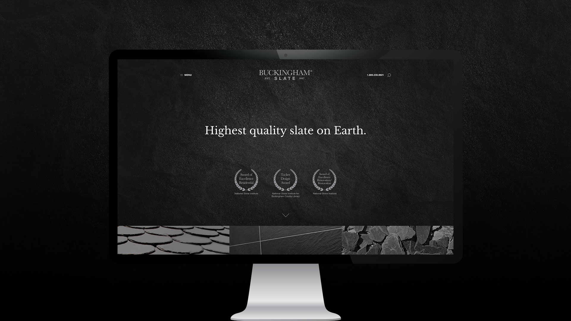
With the launch of the rebrand, Buckingham’s digital presence needed to match the new look. We took the elements we created for the capabilities brochure and turned it into a digital website. The large visuals and clean grid make digesting the information very easy and intuitive.
